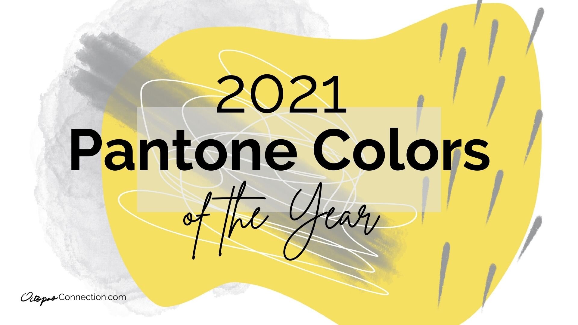
2021 Color(s) of the Year!
With 2021 comes new colors. Yay!!! I generally wait, not so patiently, every December for Pantone.com, the world’s leading color authority, to share their pick for the well respected Color of the Year. This time, they not only announced one, but two colors! This has been done before, but is certainly not the norm. So I feel like I’ve watched another piece of history unfold along with all of rest of the startling events of 2020.
However, not everyone is a fan of Pantone’s choices of Illuminating (yellow) and Ultimate Grey as colors of the year for 2021.
Vogue.com’s wrote a blogpost about the matter called, ”Pantone’s Color of the Year Is Really Weird-Just Like Everything Else Right Now.” And they aren’t the only ones who disagree. I’ve already heard many and artist and designer lamenting this choice.
I totally get it. These colors have been done before, and designers wanted something new to latch on to and to create with.
The issue is, that forecasters don’t choose colors by what will make the next great fad, or crowd pleaser. Instead, color pschycology plays a huge part in this. There are underlying meanings attached to each style trend. They tell stories of our time and of what we want to evolve into. You know the adage; what you think, you become.
And so, Pantone chose Illumunating, a bright, bold yellow, and Ultimate Grey, a soft, but present tone. Yellow is commonly associated with boldness, energy and happiness. Grey signifies softness, balance, and being neutral. In my opinion, they are both perfect. In fact, before they were unveiled, as a color forecaster, I actually selected very similar colors for my January projects. I for one need all that they represent and more, in order to face this new era we find ourselves in.
So many creatives may not be on board, but I think they’re perfect.
Watch the video to see how I worked these Pantone colors into a digital painting.
Without fail, these colors will be used in fashion, art, novelties, automotive, and many other industries all over the world.
So this is BIG. We’ll be seeing them in a lot of places throughout the year. I’m sure these color will do the job that was intended for them. To bring us hope and strength for the new things we need to do in 2021, while providing calm and steadiness as we figure it all out.
If you would like to use these colors in your work this year, I have added an image of my hand painted Pantone color swatches with their Pantone ID #’s so you can find them. I also added a fun time-lapse video of the abstract painting I used for the background of the cover image for this post.
If you want to learn how to paint your own abstract painting like the one above click here.
I’d love to hear what you think of Pantone’s Color of the Year choice! Please comment below with your thoughts. : )


